ao Entardecer
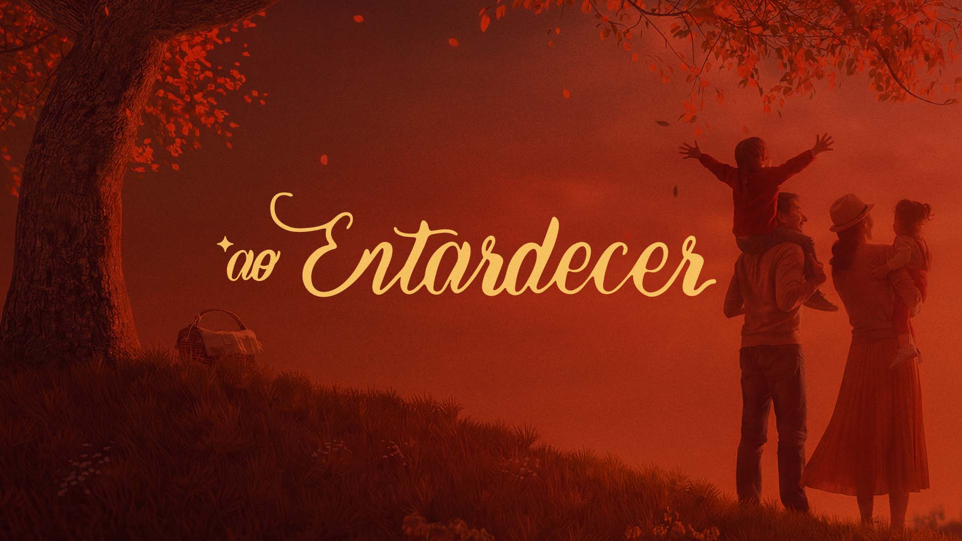
ao Entardecer ("at dusk") is a brand of family memories. It was born from the simple gesture of stopping at the end of the afternoon and recognizing that beauty was right there, waiting. Our job was to give shape to that feeling — to turn a diffuse sensation into symbol, typography and image.
- — 01
Translating an untranslatable emotion — the instant of dusk — into a replicable visual system.
- — 02
Escaping the clichés of the family segment without losing emotional accessibility.
- — 03
Balancing the authorial handwriting with a typographic structure that could support diverse applications.
- + 01
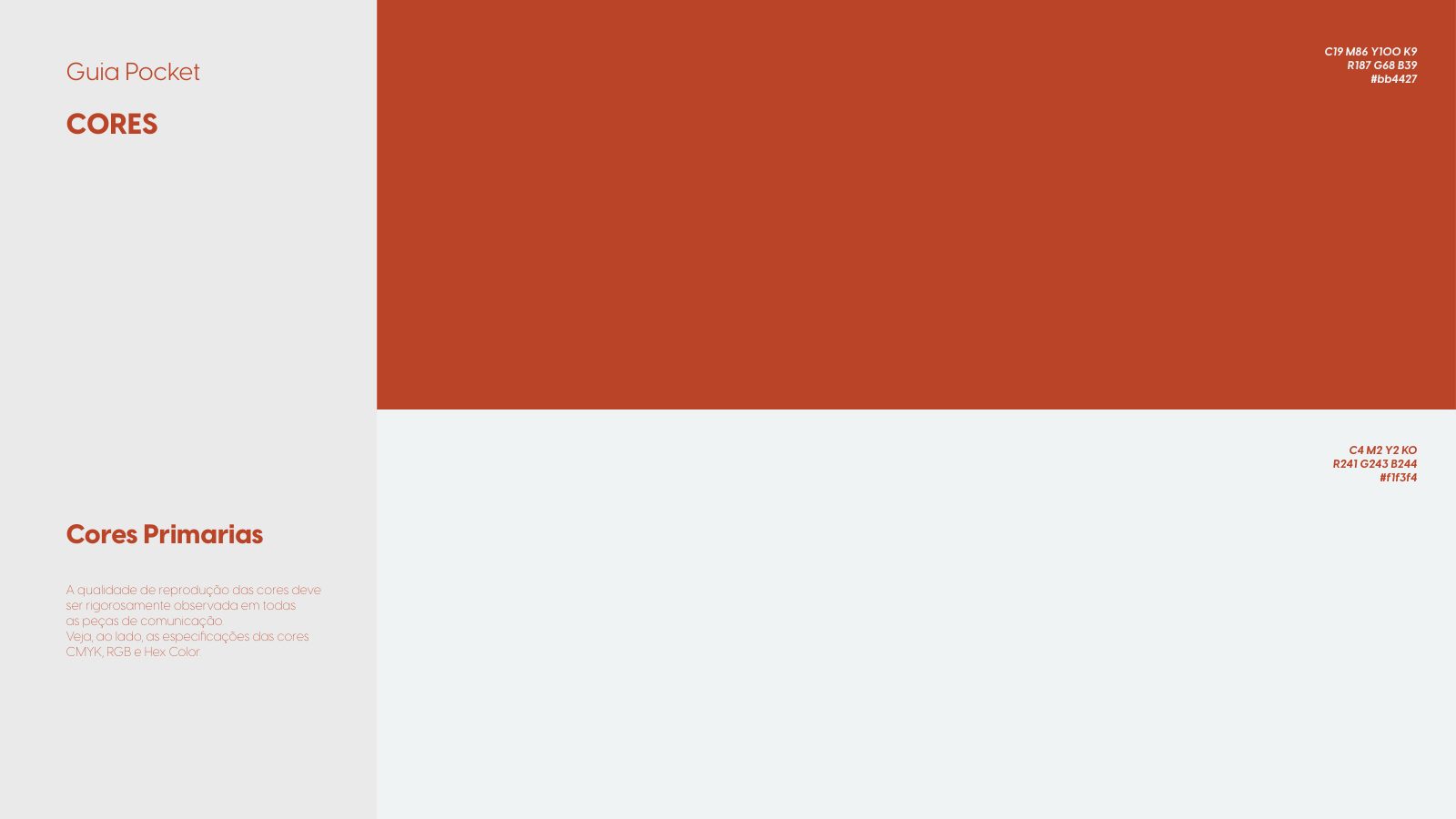
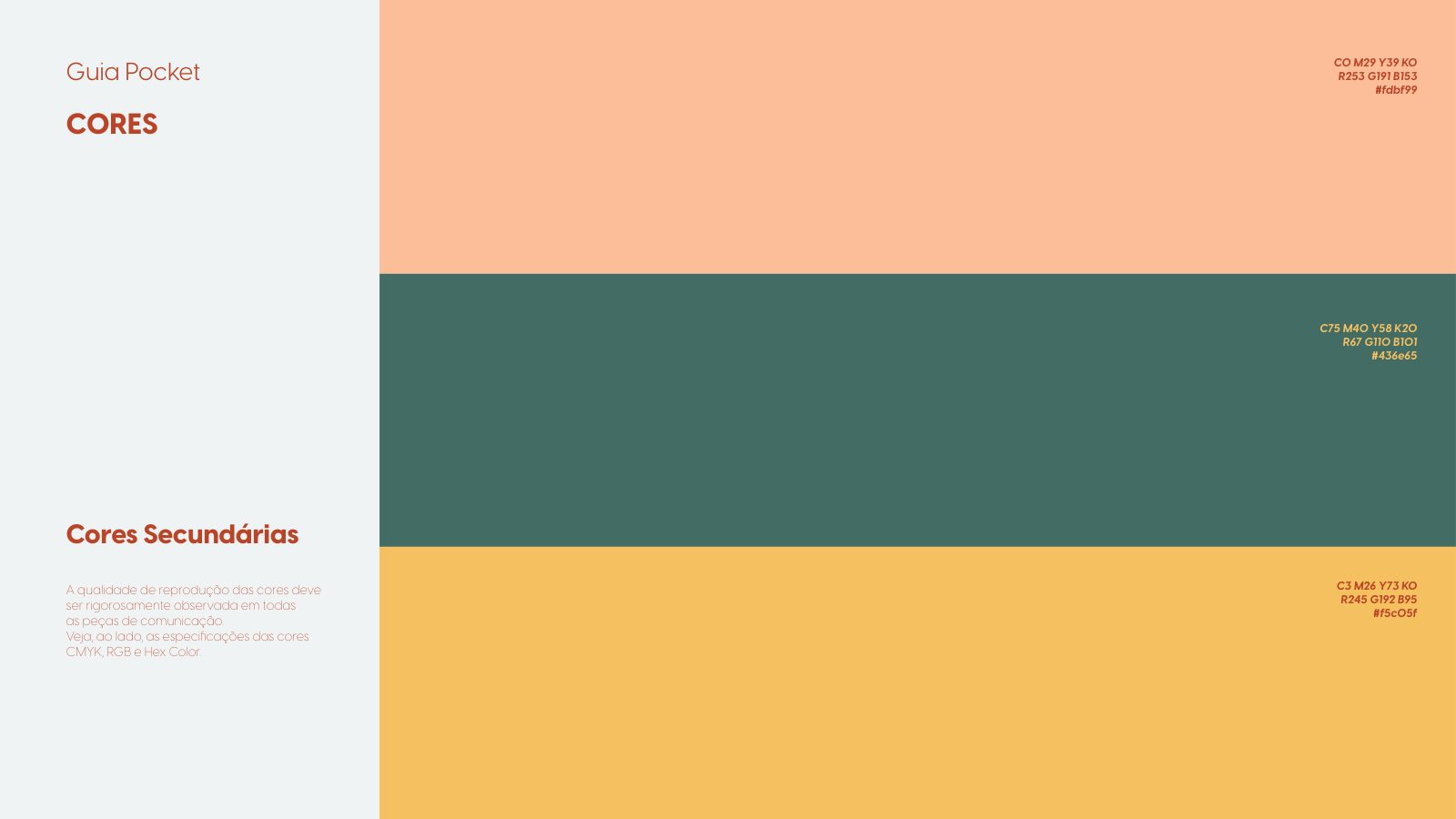
We built a cinematic palette anchored in a single scene — the red sunset — and derived the whole language from it.
- + 02
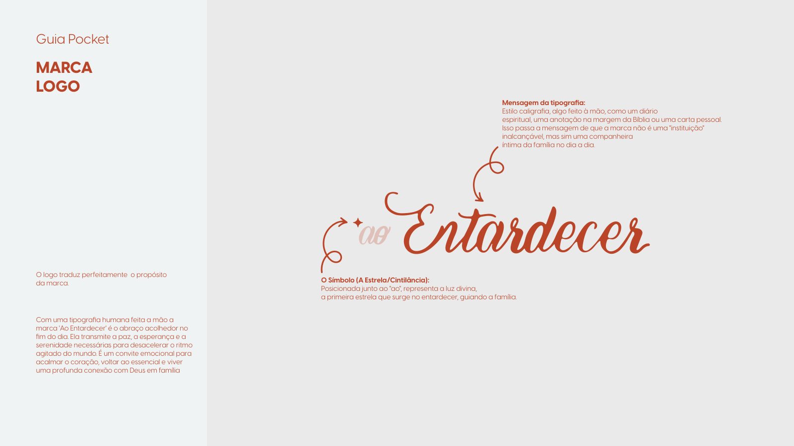
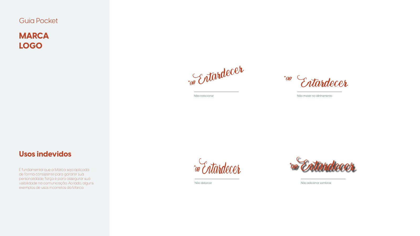
We drew the logotype by hand, letter by letter, guaranteeing a unique signature that is impossible to imitate.
- + 03
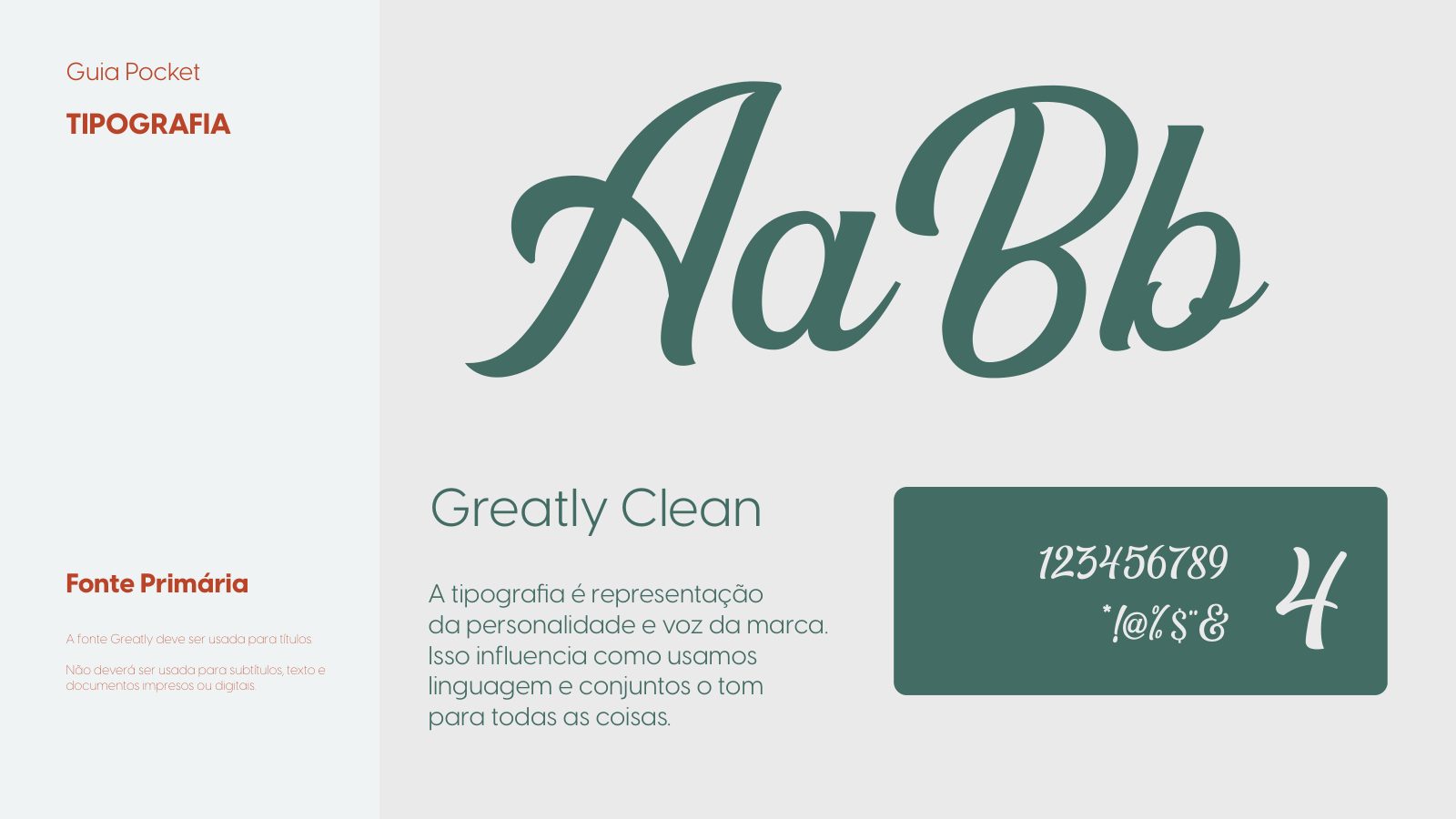
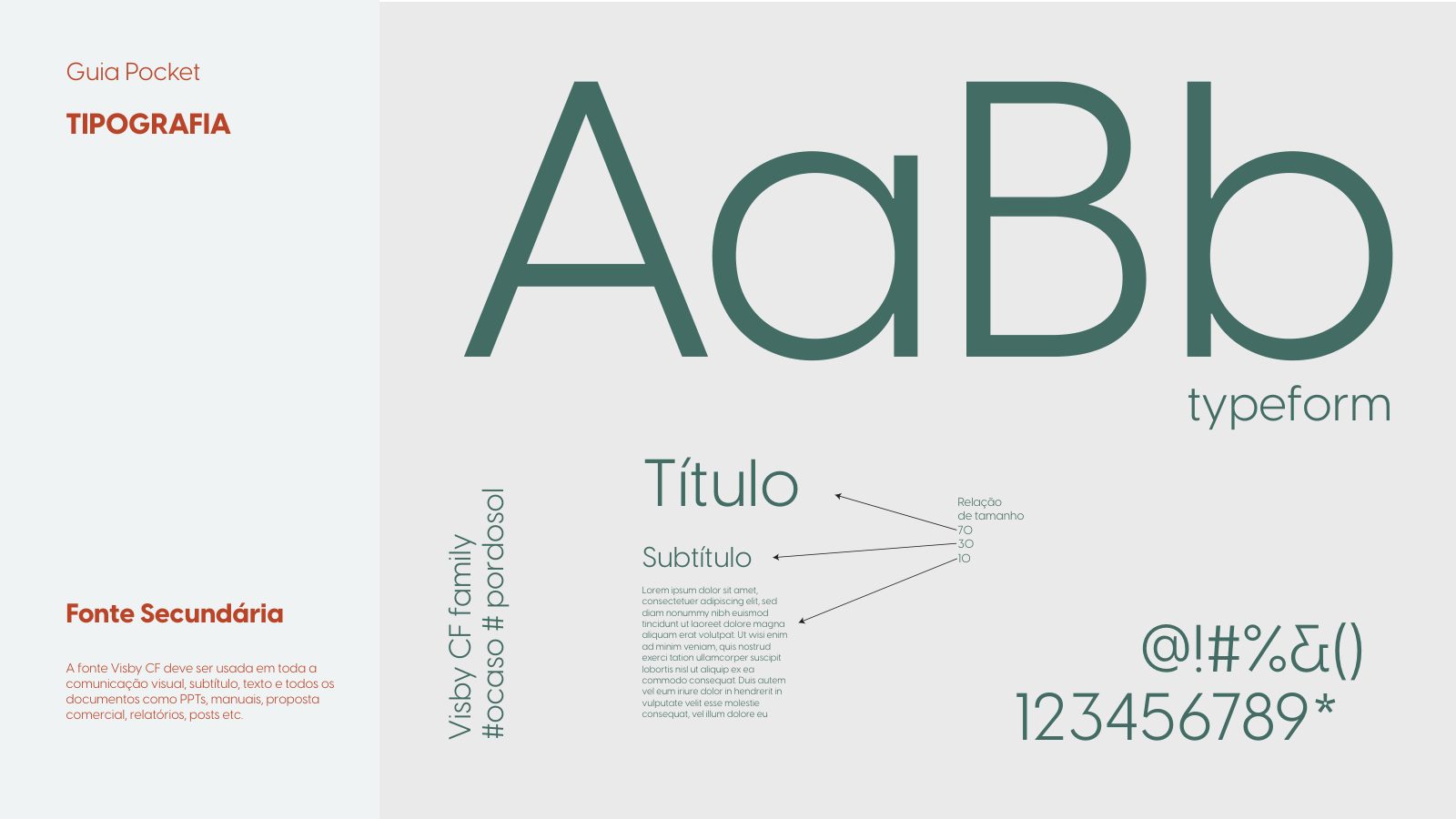
We defined an application system with a clear hierarchy: cursive for the gesture, serif for the speech, sans for the information.
Brand guidelines
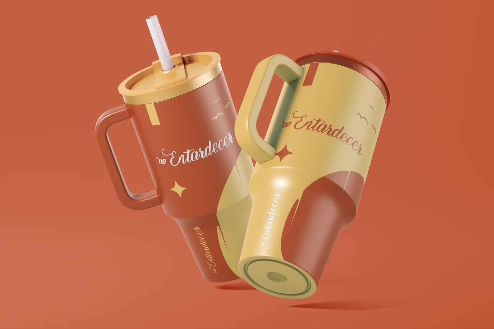
Applications
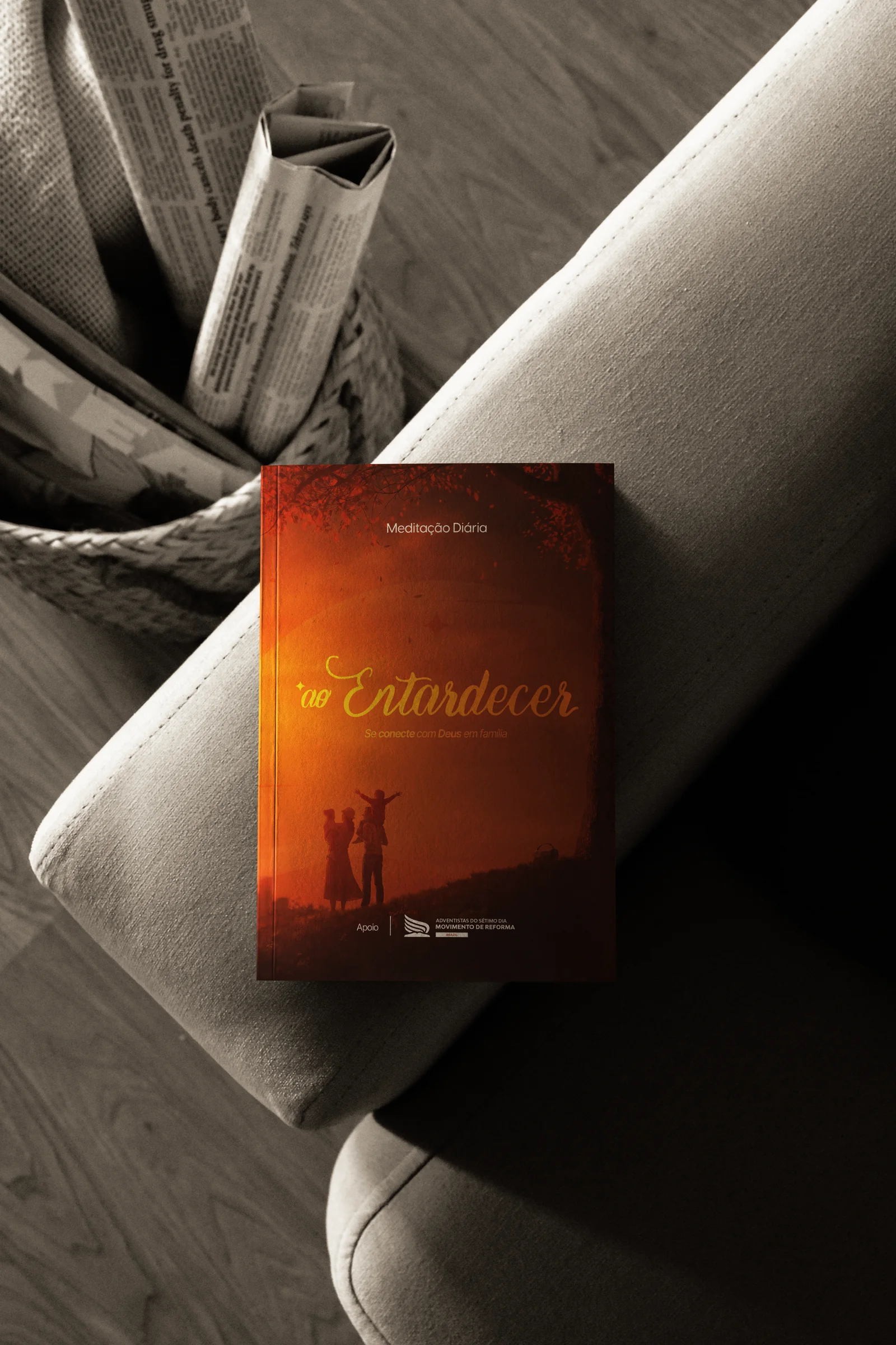
An authorial project focused on family experiences at the end of the day. The founder wanted a brand that didn't look commercial — something that sounded like a childhood memory revisited.
The segment is dominated by generic communication and pastel clichés. It lacked a voice that translated dusk as an emotional state, not as stock aesthetics.
We worked dusk as a character. The amber light, the silhouette against the red sky, suspended time — every element of the identity was born from that single scene.
Weeks of pictorial references, hand-lettering studies and palette tests. Every version of the brand had to pass a simple test: did it sound like memory or like marketing?
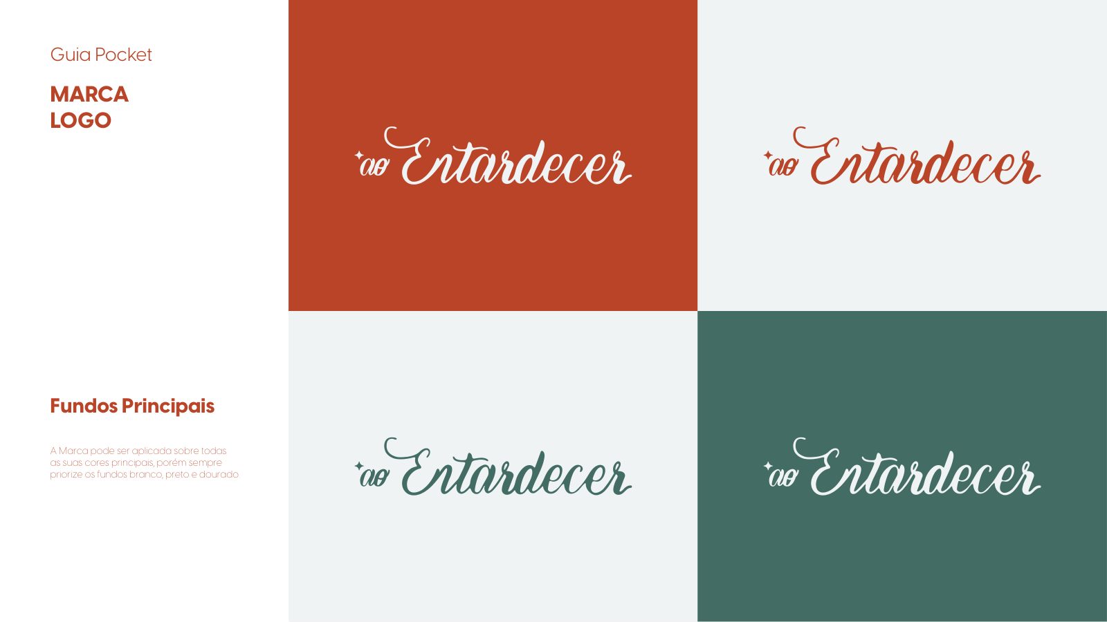
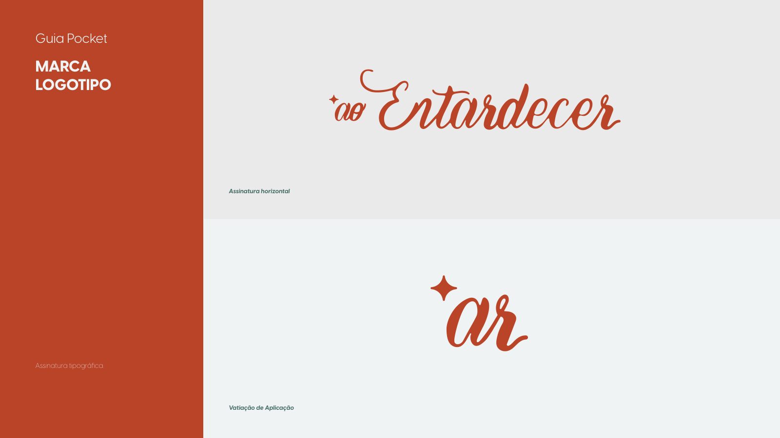
A handwritten cursive logotype, with the discreet asterisk marking the instant. An earthy palette around ember red and warm gold. Serif typography for long texts, cursive only for the gesture.
An opening film in a single shot: the family's silhouette against the sunset, no dialogue, only the wind and distant laughter.
The brand launched with a complete identity — from the symbol to applications in print, social and field experience — ready to scale without losing its soul.